20 Proven SaaS Conversion Optimization Hacks to Increase Your Sales


I talk to over 50+ SaaS clients every week, and the one thing I hear most of them struggling with is conversions. A conversion is the most critical business goal you want to achieve on your website. It can be a free trial signup, demo requests, newsletter subscription, ebook or case study downloads, etc.
So what can be done to improve conversions and increase growth? I studied some of the top brands in the world of SaaS to see how they are nudging their website users to convert better.
Here are 20 conversion hacks you can use on your website to increase your conversions:
SaaS Conversion Optimization Hacks
1. Use consistent CTAs across the website
I recently studied the top 100 SaaS brands to discover the secrets to creating a winning above-the-fold. Although there were a lot of learnings from the study, what struck me the most was the inconsistency in the CTAs. When you have several different actions you want the user to take, chances are they are going to get confused or overwhelmed and do neither of those actions. This then results in you losing the user.
It's important to identify what's the primary action you want your users to take on the website and be clear in nudging them. You can also have a secondary CTA as long as the primary, most important one stands out clearly.
Here's how Gong focuses on one primary CTA - Book a demo. This actionable goal is simple for users to follow.

2. Add conversion nudges that make your users tick
Now that you have your primary CTA sorted, the next thing would be to nudge your users to click on them. This can be done in various ways - state the benefits, solve objections, add social proof, etc.
A witty way to do this is to state the individual benefit of doing an action that can appeal to your users. Let's look at how RevenueHero is tackling this.

3. Give an insight into your product with tours, interactive demos, etc
Asking for a demo directly without providing any information on your product can seem risky or high commitment to your users. The process can be made seamless by giving sneak peeks or insights into your product's appearance and how it works. The goal is to help your user visualize how their life would be by using the product. It primarily answers the questions: Is it easy to use? Does the UI look appealing? Does it look interesting enough for me to go and request a demo?
See how Adobe does this for their Commerce product.

4. Handle any objections that your users could have proactively
Even a free trial can seem like a huge risk and commitment, if your users have questions regarding your offering, or how much it can cost them. You must have seen a lot of websites proactively addressing these doubts under their CTA to assure the users that it is not a risky proposition.
Here's how Monday.com accomplishes this.

5. Leverage live updates that make your CTA actionable
What's the best way to nudge your users to get them to take action? Tell them more people are doing it! Proof does this in a good way. The primary CTA on the website is 'Try it for free'. Hence, the nudge below the CTA tells you that 1000+ people have signed up for a free demo in 30 days. If 1000+ people have signed up, you would think it's at least worth a try!
Here's how Proof does this to boost free trials.

6. Set clear expectations of what your users get if they request a demo, sign up for a free trial, etc
Just plainly asking your users to take action without telling them what they will get after taking the said action. Take Freshworks for example, they want users to request a demo. As a demo request seems a high-commitment action, Freshworks explicitly sets the expectations on what the users can expect out of the 20-minute chat.

7. Reduce form fields and friction for your users to make submissions easily
Taking any action on your website can seem high commitment to your users. So if you want to increase your website's conversion rate, you have to reduce the barriers to entry. What does that mean? Take Rippling's website for example.
The brand wants you to sign up to see Ripling in action. All you have to do is provide an email ID. Reduce the friction as much as possible for your users to convert and they willCustomize solutions for all your target segments.

8. Customize solutions for all your target segments
When a user visits your website, you must highlight how your platform or offering, fits exactly into their daily roles and responsibilities. A generic landing page focusing on the entire product and the use cases it offers might not influence users.
Take the following example, Social Pilot has created separate landing pages that cater to each of their target segment, drilling down on their pain points and showcasing how SocialPilot is the way to go.

9. Quantify your customer base to showcase credibility
For your users to get into your funnel, they need to trust you first. Incorporating elements on your website to help your users build trust and make you seem reliable. Look at how Dropbox does this.
The hero fold on the website days 'Join over 700 million registered users'. Which indicates over 700 million people in the world use Dropbox. If such a huge customer base is adopting Dropbox, there might be something at least worth trying, right? And that's exactly what you want your visitors to feel.

10. Trial & Pricing Strategy Optimization
Free trials typically convert better than freemium (1-4%), though freemium captures more sign-ups upfront. Trials without a credit card drive higher sign-ups but lower paid conversion; requiring a card reduces sign-ups but nearly doubles conversion. This is ideal for self-serve products, while no-card trials work better for sales-assisted motions. Reverse trials are about starting users on full features, then downgrading. This can boost activation but requires a free tier that still feels valuable.
Prioritize value-focused messaging, social proof, and clear pricing (self-serve) or custom quotes (enterprise). Continuously test pricing, onboarding flows, and trial lengths: simple products often convert fastest with 7-day trials, while complex tools may need 30 days. The goal is to help users reach their first meaningful win as quickly as possible.

{{specficBlog}}
11. Get your users to take a low-commitment action
There is a good chance that your first-time website visitors might not be completely convinced to sign up for a demo with you or a free trial. So should you let them bounce off without taking any action? No! While users are just exploring the website, a little curiosity about your platform can make them want to get updates, information on the latest trends, helpful content, etc.
Against a demo form action, a newsletter subscription with just one input field seems harmless. This is also a good way to get your users into the funnel so you can nurture them.

12. Create interactive tools like calculators, and quizzes to get users into your funnel
It is a general perception that technical SaaS products are boring. Content marketing around interesting topics and the latest industry trends can only take you so far. What seems to be working for brands is creating interactive content. Interactive tools like calculators, quizzes, and assessments, capture the users' attention and get them to participate in a fun way without being salesly.
HubSpot has created some helpful tools that can inform their users about key concepts like persona, website health, brand creation, etc.

13. Create consumable guides, case studies, and checklists and offer them for free
Getting your users interested in your product happens in stages. Your users will visit the website, see if they find something interesting, read content, maybe download and informative asset, and enter your marketing funnel.
To establish credibility, it is important to come across as an authority on any subject that your users are interested in. Create assets around subjects your audience is interested in and give them away for free!

{{specficService}}
14. Leverage analytics & personalization for decision-making
Build a tight analytics stack that actually helps make decisions: GA4 for event-based tracking across feature usage and conversions, Hotjar for heatmaps and session recordings, and Webflow Analyze for instant click and scroll insights directly inside your workspace. Focus on conversion-linked metrics like demo request rate, pricing page engagement, trial-to-paid conversion, bounce rate by source, and scroll depth on key pages.
Start small: refine CTAs and headlines by traffic source, run controlled A/B tests, and ensure every change feels consistent with your brand and genuinely helpful, not intrusive.

15. Leverage social proof like impact numbers, customer testimonials, and ratings
The easiest way to get your users to build trust is to showcase the impact you have created on your customers and why they believe in you. Explore the metrics and KPIs your target audience cares about and showcase how you have been moving the needle for current customers like Leadpages does.

Also read: Proven Landing Page Conversion Optimization Techniques
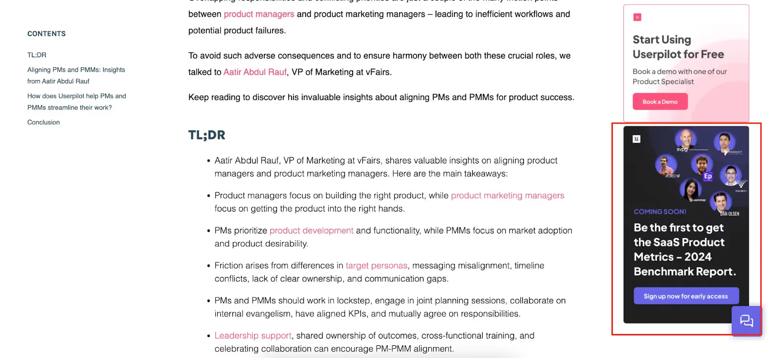
16. Create FOMO with exclusive access to sign up for upcoming assets, product launches
Content marketing, especially good content marketing, takes a lot of research and effort. Not all the content you create on your website will get consumed by your website visitors. So, how do you grab the attention of your audience and make sure your assets are consumed well? Provide exclusive access! Create interesting content and build a buzz around the release.
Take a look at this example from UserPilot.
17. Enable chatbot assistance for users who are looking for help
You can populate your website with all the helpful information you think your customers will need, or address any questions they may have. There's still a good chance that they may not find what they are looking for on your website. In situations where this happens, a chatbot comes to the rescue. Use a chatbot to assist your users, like Freshworks does.

18. Craft headlines and CTAs that speak your buyer’s language
Your headline should immediately communicate your unique value proposition in the language your prospects use. Instead of generic phrases like "Advanced Software Solutions," use outcome-focused headlines like "Cut Customer Support Tickets by 60% in 30 Days". Test headlines that agitate pain points ("Still Manually Managing Customer Data?") against those that promise solutions ("Automate Your Entire Customer Journey").
Support your headline with visuals that demonstrate your product in action: dashboard screenshots, workflow diagrams, or before-and-after comparisons. Place your primary CTA above the fold and use contrasting colors to make it impossible to miss. Secondary CTAs should be visually distinct but not competing with your primary conversion goal.
Position your primary CTA above the fold, and repeat it throughout longer landing pages. Use action-oriented copy that speaks to the specific benefit ("Start My Free Dashboard" rather than "Sign Up").

19. Enable social logins to reduce barriers to entry
Your website is the first impression your users will form of your brand. It should include everything necessary to get your users excited about your platform. If the users get curious about your product after going through the content, they can book a demo, but what if they don't want to take the effort to fill out an entire form?
Reduce the barriers that your users have to pass through before they can use your product, and you will see an increase in conversion.

20. Keep up with A/B testing and data-backed optimization
High-performing SaaS companies validate decisions with data, not intuition. E.g., Dropbox, which increased signups 10% by shifting its headline from “storage” to “simplicity.” A/B tests let you compare two versions of a single element (e.g., “Start Free Trial” vs. “Get Started Free”), while multivariate tests explore how multiple elements interact, such as pairing different headlines with various CTA styles or form lengths.
The highest-leverage areas to test include value-driven vs. feature-driven headlines, CTA text and placement (including sticky CTAs), types of social proof, and form length or structure. Tools like Google Optimize, VWO, and Webflow Optimize (beta) streamline experimentation with built-in analytics, heatmaps, and visual variation editing. Such tools make it easier to run fast, meaningful tests that directly lift conversions.

{{ctaBlock}}
Ready to Turn These Tactics Into Revenue Growth?
Converting website visitors into paying customers isn't about implementing every tactic at once. It's about systematically testing and optimizing the strategies that go with your audience and business model. The most successful SaaS companies treat conversion optimization as an ongoing process, not a one-time project.
At ThunderClap, we've redesigned over 129 B2B websites for SaaS companies, from product-led growth startups to enterprise platforms. We build sites that help SaaS and tech brands dominate their markets.
Your website either drives growth or it doesn’t. Make it count.
Book a free demo with ThunderClap and see how we turn websites into your strongest growth asset.



.webp)
Browse Similar Articles


Interested in seeing what we can do for your website?


.webp)




.svg)














.avif)

























.avif)