Improve Your Webflow Website with the Actionable Insights


Stats say that 94% of website users’ first impressions are design-related. But is a beautiful website enough to bring you conversions? No, an appealing but non-functional website won’t bring you desired results. Imagine seeing a sleek design and color gradients loading after 15 seconds. How frustrated would that make you?
In B2B SaaS, your website proves to be an important touchpoint for your users to build recognition of your brand. Around 75% of your customers will judge a company’s overall credibility based on its website design.
So, how to improve the quality of your website? It starts with the right CMS.
Why Do You Need to Consider Webflow as Your CMS?
Webflow is an all-in-one, scalable solution for your business designed for high performance. Let’s deep dive into why Webflow is the right choice for you.
- Webflow includes hosting with high uptime and performance, which eliminates the need for third-party hosts
- Webflow offers a global CDN powered by Fastly and AWS for faster load times at no additional cost
- Webflow automates caching, ensuring updates get executed smoothly without needing extra plugins
- Webflow handles updates in the background, which reduces the risk of plugin clashes or website crashes
Importance of Website Design in SaaS
Whenever you want to research a business, the first thing you do is Google it. Websites today are an invaluable asset for all businesses, especially B2B SaaS. The B2B purchase journeys span over months, during which your prospect will refer to your website multiple times before making up their mind.
If your website loads fast, publishes relevant content, and has a memorable user experience, this can improve your chances of closing the deal.
11 Tips to Improve Your Webflow Website Design
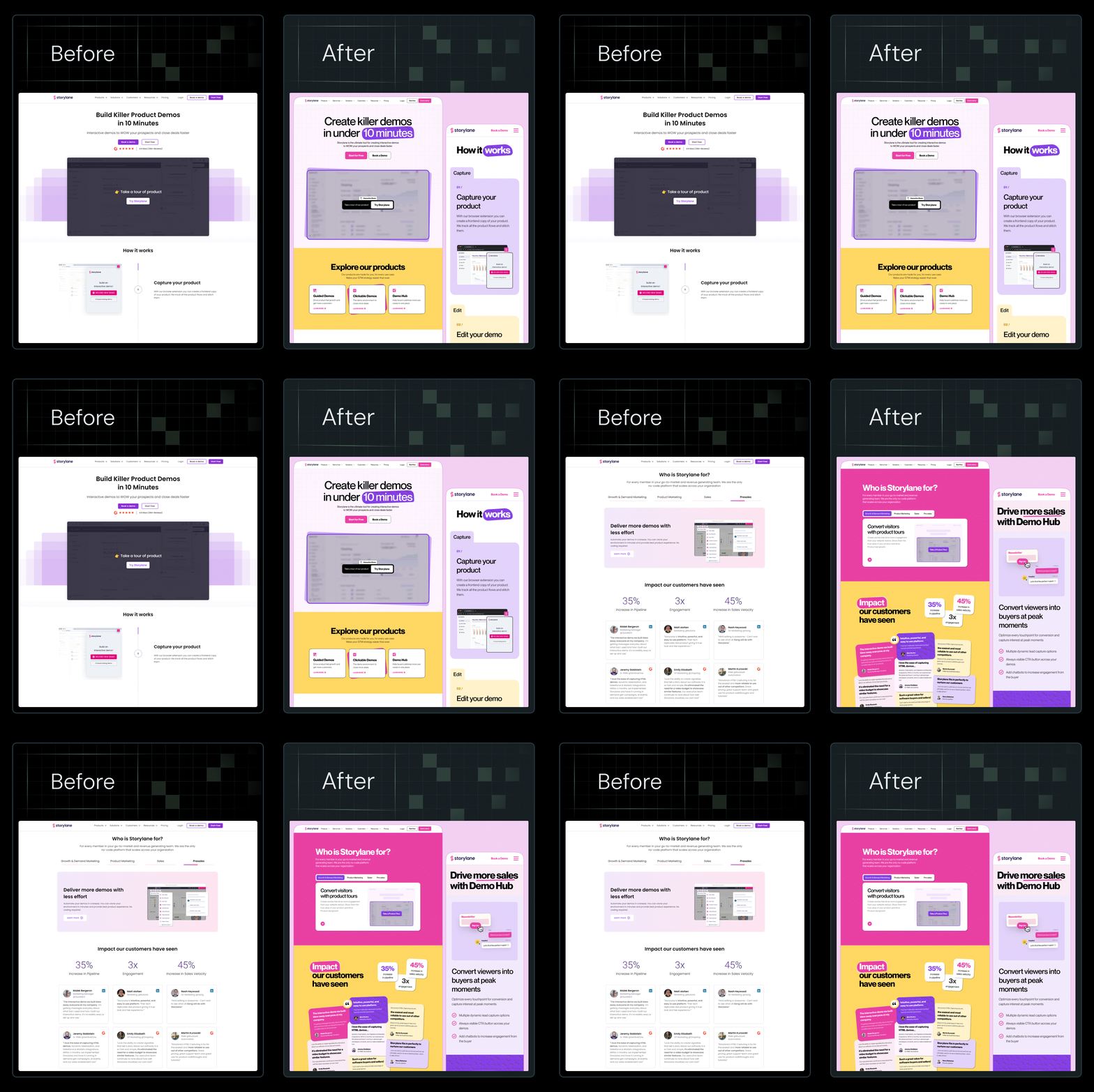
After redesigning 129+ websites, ThunderClap suggests these 11 proven hacks to improve website designs and drive conversions.
1. Set Clear Goals
Often, projects are picked up because your manager or their manager says the website doesn’t ‘suit our brand’ currently. A subjective opinion like this would create a chaotic vision for your website that’s difficult to translate into reality.
Ensure that you have clear goals before you get started with your website redesign. The goals can be conversion KPIs, some engagement metrics you want to move, etc.
2. Focus on Responsive Design
Responsiveness is one of the important tips to improve the website design. Creating a good website design goes hand in hand with creating a good user experience. With 60% of your website visitors coming from mobile devices, it is crucial to ensure they have a seamless experience navigating through the entire website.
Drill down into your website usage on various devices and keep all of these in mind while creating your responsive designs.
3. Optimise Visual Hierarchy
Imagine having a crowded website mega menu that points you to 20 different pages simultaneously, with no clear hierarchy in place? A confused user will always leave the website without making an effort.
Evaluate which pages or sections on your website are the most valuable to the users and make it effortless for users to browse through these. An optimally designed website header and footer will always ensure good discoverability.
{{specficBlog}}
4. Enhance Page Speed
Site speed insights suggest that 83% of your visitors expect a website to load in three seconds or less, and if it takes longer, 40% of them will leave. With our attention span being what it is, users today don't have the patience to wait for websites to load to look for what they want.
Conduct a technical audit of your website and optimise the factors that hinder a smooth user experience.
5. Leverage Interactions & Animations
A static website looks like a long PDF that gets boring to scroll through. Especially if the SaaS product is complex, brands will find that their websites have extremely low engagement times since a static website fails to excite users.
Ensure to add relevant product animations, lively transitions, immersive colours and patterns as a part of your design to ensure that your users are engaged at every step of the process.
6. Use Consistent Branding
Another thing to consider is that your brand should always remain consistent across all marketing collaterals. Your prospects need multiple interactions to build a brand recall and creating disjointed experiences can be a wasted effort.
Create a brand guideline and ensure you stick to it across all marketing communications.
7. Optimize for SEO (Webflow SEO Best Practices)
To maximize organic search ROI on Webflow, build a differentiating content strategy with the platform's native tools. Start by optimizing on-page elements like meta tags and semantic HTML hierarchy. Utilize Webflow CMS Collections to scale content while maintaining SEO-friendly URLs, and use internal linking to improve crawlability. Finally, take a look at technical essentials: fit auto-sitemaps, manage 301 redirects, and get high Core Web Vitals scores by compressing images and minimizing heavy animations.
Related Read: 5 Tips & Best Practices for Maintaining your WebFlow Website
8. Improve Conversion-Focused Design
No user is going to tap a button that’s too hard to find or not appealing to look at. Instead, if you revamp the button and add a nudge with FOMO, your users are likely to convert! Conversion-focused design aims to take into consideration everything that your user needs - their pain points, challenges, desired solutions, and presents them in a way that the desired action seems almost effortless.
Using psychological nudges, minimal options, clean interfaces, social proof, and direction cues all add up to a good user experience.
9. Eliminate Dev Glitches
After you have created user-centric designs, ensure that there are no roadblocks during development. Use a clean structure, optimise for performance, and test your website thoroughly across devices to ensure optimal usability. Back up the website regularly and do a thorough QC before launch.
Work with trusted and experienced Webflow agency developers and designers to bring your vision to life. Here’s a guide on how to choose a best webflow agency.
10. Analytics & Data-Driven Improvements
The best B2B websites evolve using user behavior and performance data, not assumptions. With Webflow’s Google Analytics integration, you can quickly track traffic sources, conversion paths, and run advanced event tracking through Tag Manager. Hotjar adds the “why” behind the numbers with heatmaps and session recordings that reveal drag points.
The metrics that matter most are conversion-driven: meetings per 1,000 sessions, the share of traffic hitting BOFU pages, CTA click-through rates, form completion rates, and speed-to-first-touch. These are all direct indicators of how well your site is driving a qualified pipeline.
{{specficService}}
11. UX Competitive Analysis
A UX competitive analysis helps you spot gaps your website can clearly win on. Start by listing 5-10 direct and indirect competitors your buyers actually compare you with, including sales rivals, keyword leaders, and category benchmarks. Review how they structure navigation, present their brand visually, communicate value, and guide users to take action. Track where CTAs appear and how journeys flow from awareness to conversion. Use these insights to design a clearer, faster, and more persuasive Webflow experience that beats expectations.
Ready to turn your website into your best sales asset?
Your website design decides if prospects come back or move on. In B2B, buyers don’t follow a straight line. They touch your brand multiple times, over long journeys. If your website doesn’t look and feel consistent, they won’t remember you. A conversion-focused engages, delights, and guides users while keeping your brand top of mind.
{{ctaBlock}}



.webp)
Browse Similar Articles


Interested in seeing what we can do for your website?


.webp)




.svg)













.avif)
























.avif)