


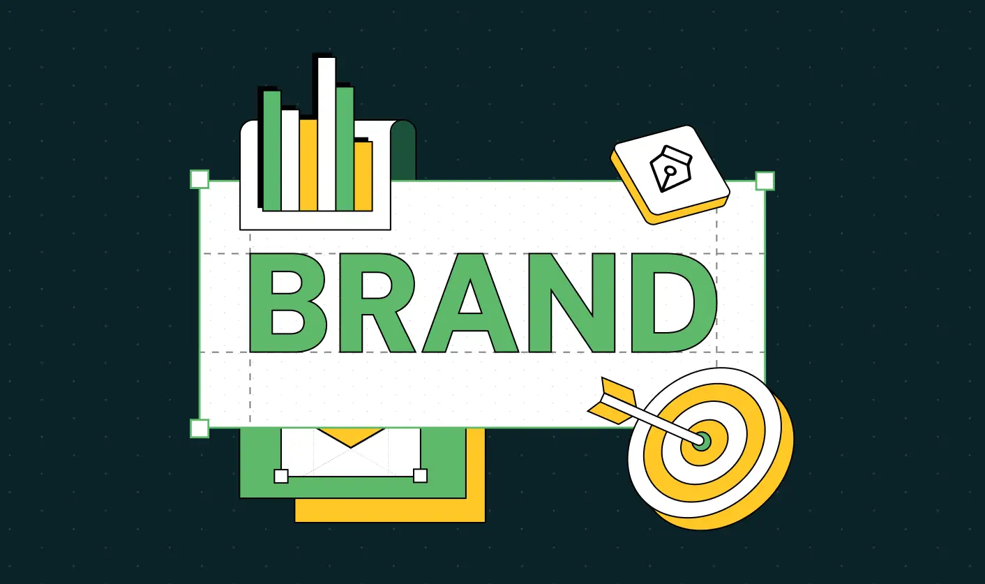
Decoding The Above the Folds (ATF) Of 100 SaaS Brands [Backed by research]


ThunderClap helps B2B SaaS brands build websites that are not only appealing but highly converting. Our strategy to come up with a website and messaging strategy for brands requires a lot of research. Once such research is uncovered here.
I did an analysis of 100+ leading B2B SaaS companies to uncover the elements above the fold on their business websites. The research unearthed some unusual insights. However common these elements may be, they aren’t adapted by a huge chunk of leading businesses.
Here’s the ultimate guide for you to ace above the fold optimization.
1. Pre-heading
We go all creative on the copy and the essence of the brand goes missing. Add a short pre-heading or label mentioning what your product exactly does.
Almost 10% of the websites, topped above the folds with a pre-heading. Like Wistia - mentions 'Video Marketing Platform'. No matter how quirky you get with your headline, your primary offering still gets communicated to your users.

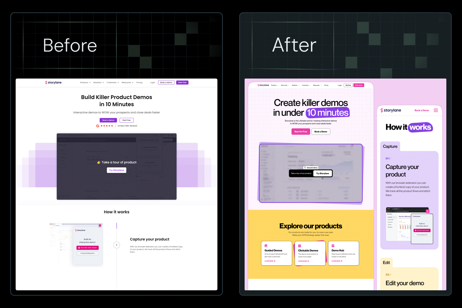
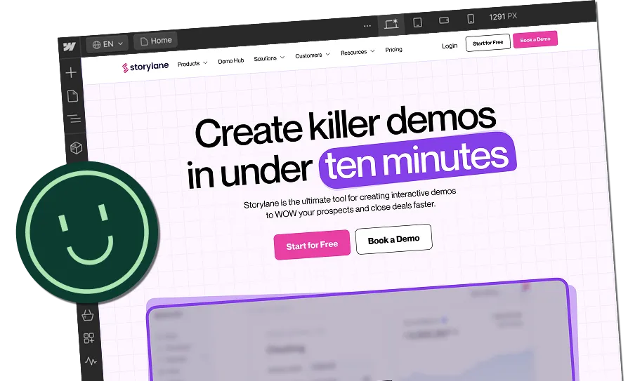
2. Heading and Subheading
Your users should get a complete understanding of what your business offers after reading your headline. It should address the question - what your business is and why should they care. There are a lot of ways to write copy - highlight benefits, highlight features, make claims, mention how your users' lives will change after using your platform, etc. 80% of the brands mentioned their value proposition.
Websites with the best recalls had the following:
- A short copy (4-5 words) that played with words, and described the offering in the simplest way possible
- It was written in the second person and seemed like an interaction
Example: See how Typeform uses a short, catchy headline that highlights its primary offering.

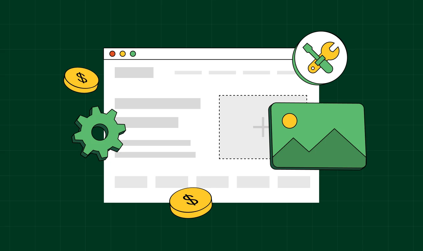
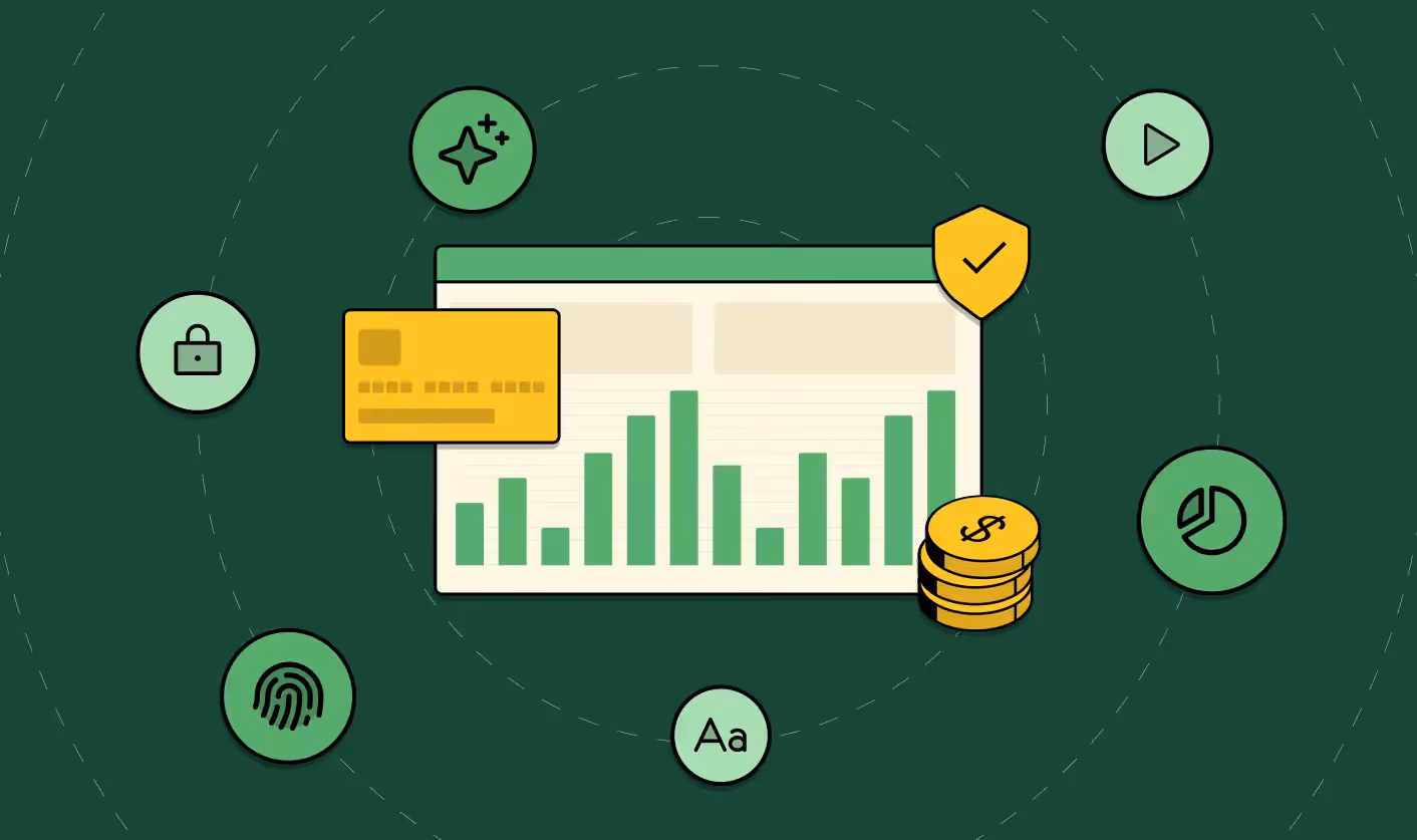
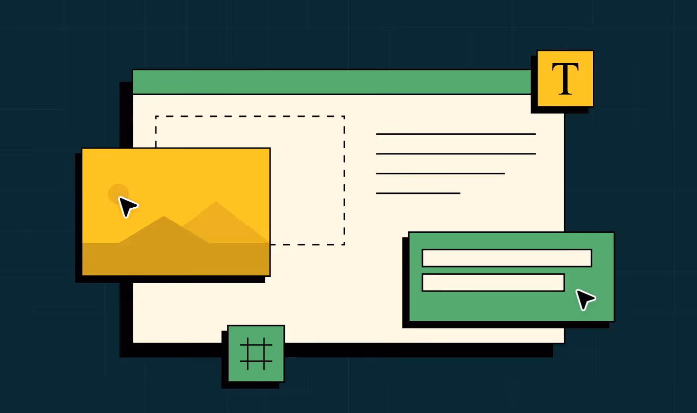
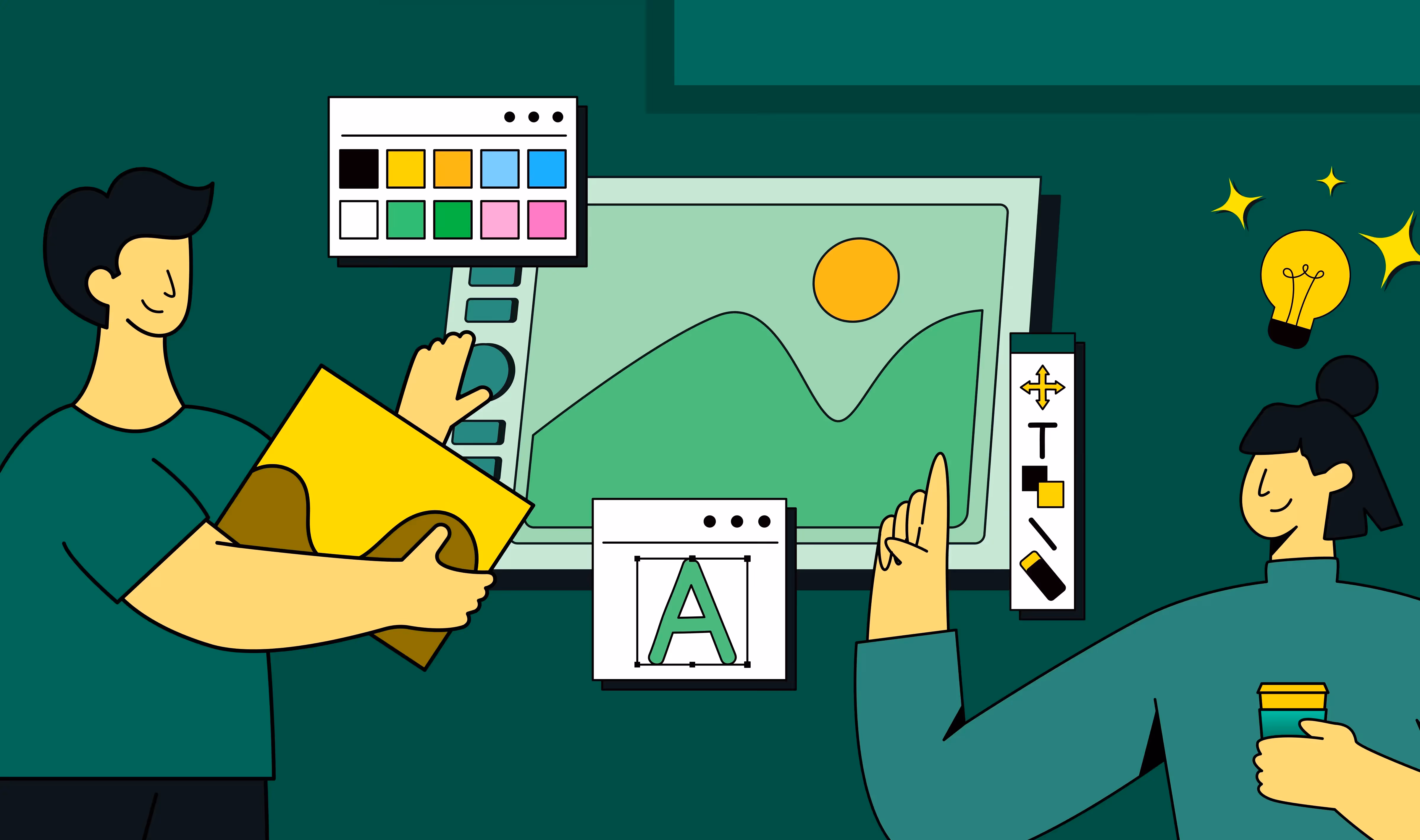
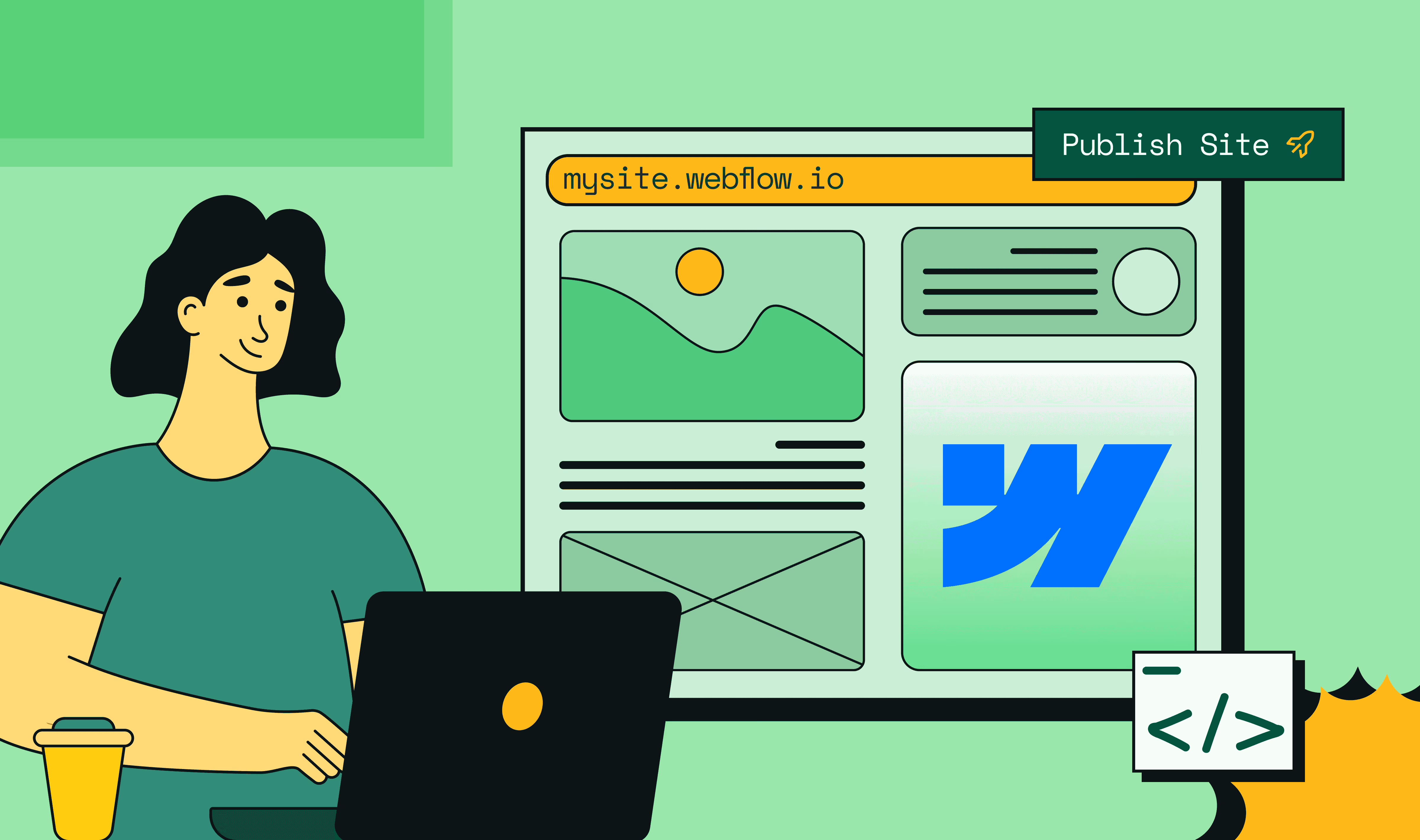
3. Illustration/Visual
If you are going to use an illustration, choose one that supports the copy, or don't use one at all! Having an irrelevant stocky, illustration distracts your user and will lead to them bouncing off if they don't find it appealing. Illustrations should generate curiosity about your product. If you are a platform-based company, give a sneak peek of your dashboard, if you are a product company, give an inside view of your customers using the product. Around 20% of the brands we studied feature visuals that have nothing to do with the product. Here's an example for one of the effective way to optimize for above the fold.
Example: RevenueHero features a product illustration that shows users what the platform would look like and piques interest.

4. Call-to-Action
Before adding a call to action on your website, ask yourself - what's the one action you want your users to take? Not such a simple answer. Over 68% of brands have multiple CTAs or similar CTAs with varied text on their hero fold. This dilutes focus and leads to decision fatigue and inaction. If possible try to implement a no-friction CTA - sign in directly with an email field. Over 10% of the brands we studied do this.
Example: Gong maintains a consistent, Book a demo CTA across the website so the users are encouraged to take one focused action.

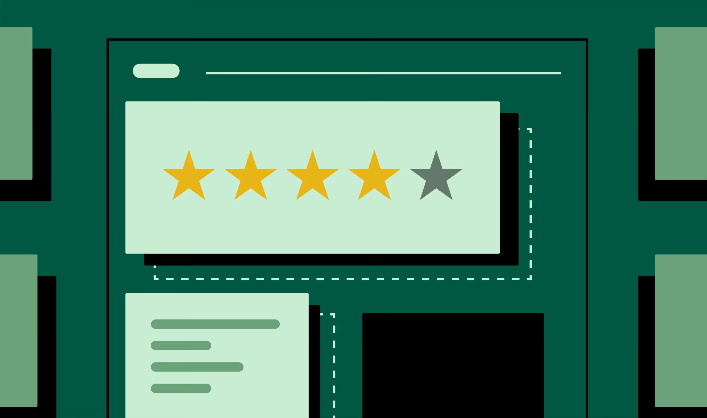
5. Social Proof
Social proof seems like such a no-brainer, but do all businesses utilize it above the fold? Our study says no! Only 60% of brands showed off social proof - testimonials, customer logos, ratings, and impact in the first fold. If you the user has to scroll to find social proof, you have already lost them as the drop-off rate between the first and second fold is a staggering 30%-50%
Example: Leadpages does this beautifully. Right above the fold, you can see their clients featured with the impact they were able to generate with the platform.

6. Objection handling
What can stop your users from taking the action you desire? Think about it and highlight it under the CTA. The trial won't cost them anything? Add free forever. They might have trust issues. Mention no credit card required and so on. Only 13% of the brands we studied proactively deal with obvious objections.
Example: Look at Zapier. A major concern around a product is the cost associated with it. Zapier proactively clarifies this concern with their statement - Free forever for core features.

7. Layout and design
Visiting your website is an experience. Make it that way. Create an immersive experience that makes them want to stay on your website for a long time. Only 5% of the brands we studied did this. At the same time don't add so many elements that the users are confused about what to focus on. Keep it clean and simple for a better recall.
Example: Synthesia’s clean layout helps you focus on the core proposition - Turn text to video in minutes.

You can incorporate all these elements to create a stellar hero fold for your website. But at the same time, don't forget the basics. A 1-second delay in mobile load time can increase bounce rates by 37%. Have your hygiene checks in place - ensure that the website loads fast, is easy to access, is mobile friendly, etc.
You can find the screenshots of the hero folds and our analysis for better understanding.


.webp)
Browse Similar Articles

How to Choose the Best B2B Website Maintenance Company: 9 Questions to Ask Before You Hire One

.svg)


How to Use Brand Storytelling on Your Website to Close More B2B Deals and Build Buyer Trust


Why Partnering with a B2B Brand Positioning Agency Accelerates Market Differentiation

.avif)

10 Product Marketing Companies Powering the Fastest-Growing SaaS Brands in 2026


Outsourcing Web Design: Cost-Benefit Analysis for Mid-Market & Enterprise Brands
From Leads to Lifetime Value: How Growth Marketing Agencies Scale SaaS Revenue

Webflow vs WordPress: Which Platform Is Better for Your Business Website in 2026?

Fintech Web Design That Builds Trust: 8 UX Principles Every Fintech Site Needs

Optimizing for Intent: How B2B Website Messaging and UX Changes Help Capture Top-Funnel Buyers


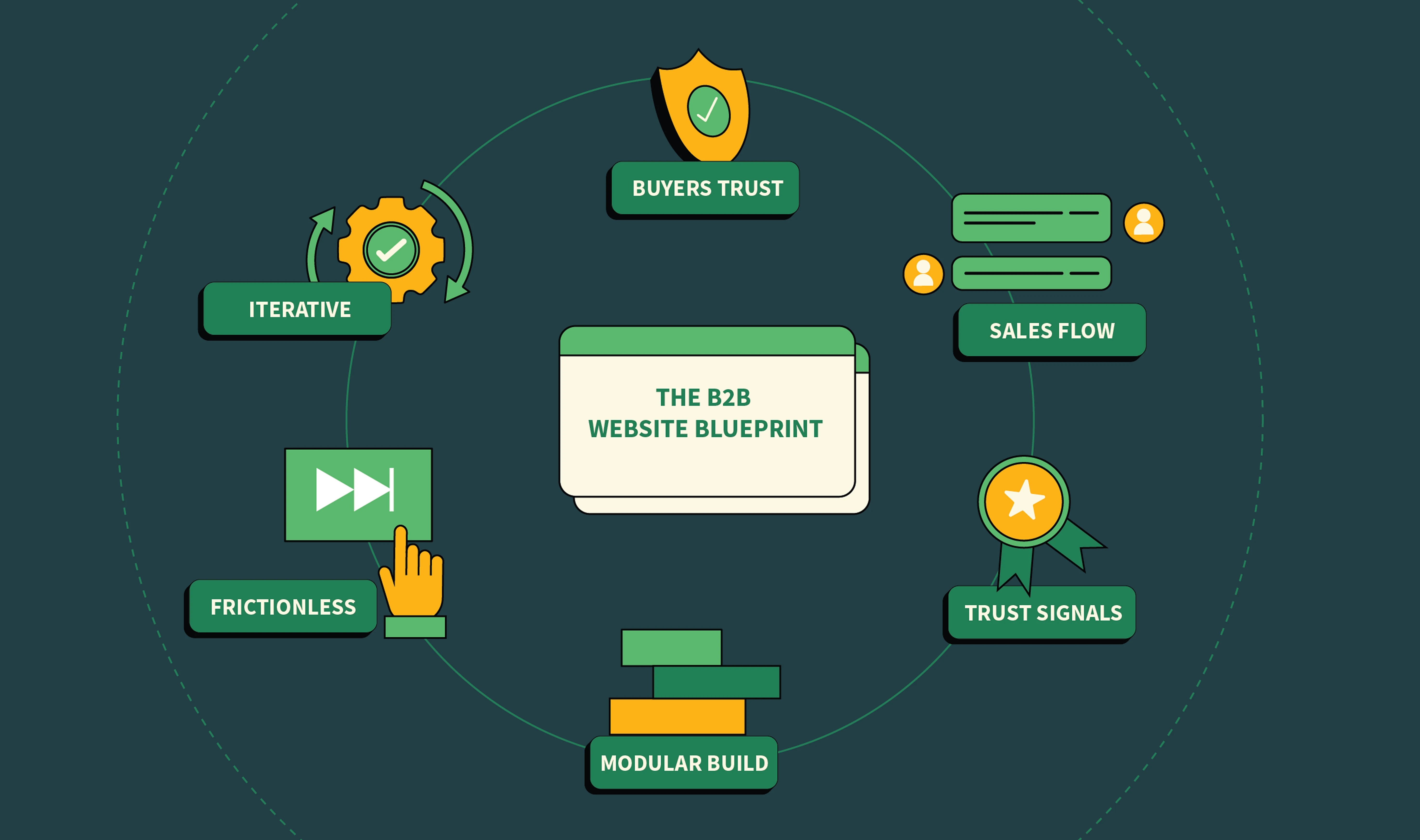
From Audit to Action: 8-Step Process to Optimize Your B2B Website Strategy for 2026 Buyers


How to Design a High-Converting Landing Page from Scratch (2026 Edition)


How to Optimize a Landing Page for Maximum ROI: A Step-by-Step Breakdown


AI Landing Pages That Convert: 7 Design Principles Every AI Platform Should Follow


Top 7 Webflow Integrations to Supercharge Your Website's Performance and Conversions


10 Best Web Design and Development Companies in India [B2B Focused for 2026!]


How to Choose the Best Webflow Agency: A Complete Guide for Your Business

Levels of Customer Awareness: How Slack's Evolving Messaging Strategy Matches User Awareness Stages: A Study

.avif)


Interested in seeing what we can do for your website?


.webp)
